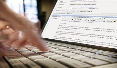
Today we offer you some rules and some practical advice to make sure that the textual content of your website is also pleasant to read.
First of all thelayout some text on a site is not easy. The harmony between written and graphic parts is not to be underestimated. The font type that is used and its characterization are just as functional to the general performance of the site as is the graphic layout.
Which font to use for a website?
The format of text on the web
If in a magazine, in a newspaper or in a book, the choice of font has a graphic, stylistic and functional importance, this will happen even more in a Web page. fast reading on the screen it is much more difficult than a reading on paper, both for the brightness of the video and for the waiting time in front of a monitor. It is no coincidence, therefore, that a text, conceived for paper and shown on video, must necessarily undergo modifications, cuts, treatments in the structuring and visualization of the fundamental concepts.
The attention of the gaze on the page is not continuous as in the case of reading on paper. The eye makes one visual scan of the page in its entirety, capturing here and there important elements to dwell on: paragraphs, words in bold, bulleted lists, symbols.
In this context the choice of font it has a fundamental value both for identifying the main content and its relevance to what you are looking for, and in terms of readability.
It is no coincidence, therefore, that there are fonts created expressly with the aim of being read on the screen, which are the ones we find most frequently within the Web pages.
Text, Colors and Background
Another fact not to be overlooked is the visual and chromatic rendering of the text on one page. A block of words too dense, a font size too small, a text all in bold, immediately demoralize the reader who has little time and gets tired quickly and maybe he knows that he can find other contents of his interest elsewhere, better paginated and arranged more fluidly.
It has been proven that dark-colored text, preferably black, on a light background is the most legible of all. More generally, there must be a sharp contrast between words and background: here the tone-on-tone rule doesn't work at all.
The font
A Web designer who chooses a font for the text of his site has, in theory, available an infinite number of fonts to use to best render the graphic balance. The choice, however, is subject to two fundamental factors:
- legibility the font used;
- compatibility of the font with the fonts installed on the navigator's computer.
To overcome the second point and use characters that follow the graphic layout of the site, we use the text in graphics. That is to say that, often, we choose to report textual parts in image format (texts written with a graphics program and saved for example in a gif or jpg file). The same is true when building entire sites in Flash. In these cases you have full freedom in graphics and in the representation of the text, but we must never forget the requirement of readability.
Two other important requirements for web pages are:
- indexing of the individual pages;
- the ease of carrying out updates.
If we want the content of the site to be indexed in search engines and, therefore, reached by an increasing number of users, we must report it in textual form.
As for updates, however, we must ensure that we have the ability to change the text quickly and easily. Precisely to always take these needs into account, it is advisable to minimize the text in graphics by using images for particular writings such as pay-offs or titles.
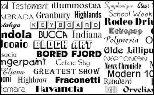
With the advent and diffusion of the internet, new fonts have been specially created that are ideal for reading on the screen. Let's consider the two most popular and famous: the Verdana and Georgia.
- Verdana: and the best font to use on the web. The characters are well spaced, proportionate and legible even at rather small sizes. Bold is always very visible and similar characters are well differentiated. The font was released in 1996 by the Microsoft typography group and the name refers to the term "verdant" which indicates a green area, such as that of Seattle.
- Georgia: It is the evolution of Times New Roman. It was created to be read on video and the its shape gives greater elegance and lightness to the letters. The release of the font is dated 1993 and is always by Microsoft. The name derives from the American state.
A single font is never used in the creation of web pages. In general, a font family is attributed to the text. The old tag was once used face: in this way it was possible to assign customized “standard” groups of characters to the text. Eg:
in doing so, a user who had not installed Verdana on his pc (which is unlikely) would have displayed the text with the Arial and so on.
The arrival of CSS
The real revolution in the management and formatting of text was made with the introduction of CSS (style sheets), today used not only for text, but above all to set the layout of websites.
In the "families" the fonts can be indicated by two specifications:
- family-name: the name of the characters to use. If the name has spaces, such as "Times New Roman", it should be enclosed in quotation marks.
- generic-name: Indicates the type of font, in particular:
- serif: font with thanks;
- sans-serif: sans serif font;
- cursive: handwriting type font, which imitates handwriting;
- fantasy: decorative character;
- monospace: monospaced font, with fixed width.
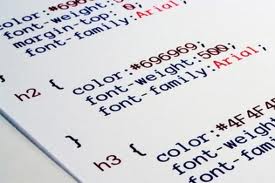
The font tag looks like this:
(font argument let's mention the other attributes. Font-size, for example, indicates the font size. It is generally expressed in pixels, but a value can also be assigned in other units of measurement, absolute values or percentages.
Specifications indicating the font-style, font weight, fontvariant and text-transform indicate all the attributes relating to Italian, bold, uppercase and lowercase. It is also possible to indicate color and decoration.
The great innovation brought by style sheets also concerns the ability to manage line spacing, margins, distance between letters, spacing from a box or the ability to create customized bulleted lists just like a text editor.
This is how Web pages have become more sophisticated in the display of written texts and accurate in the general graphic layout.
The emotional and emotional value
The characters communicate: the more linear and professional ones like theAvant Garde, Futura,Helvetica, the "handwriting" as Mistral, glossy handwriting indicate confidence and calmness, while the more playful ones (Comic Sans, Comic Strip) evoke a cheerful world and refer to comics.
La choice of font it is, therefore, a direct consequence of what one wants to communicate and the type of communication you want to establish.